Building Widget Dashboard using UWP and Caliburn.Micro
 In this tutorial we will create an UWP Dashboard app. The dashboard will contain widgets where each widget is a self contained part, providing functionality to the app. We will be using Caliburn.Micro to build the app.
Background
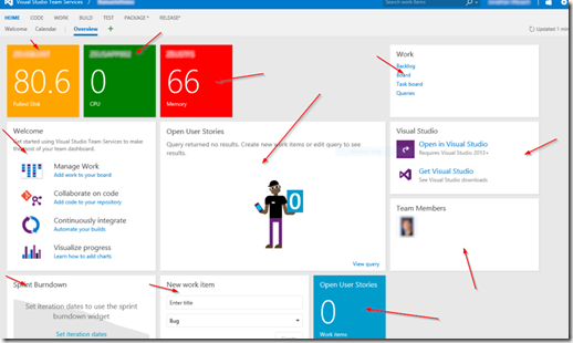
We all have used widget based dashboard apps. VSTS’ project front page is just one example (you can see red arrows pointing to individual widgets):
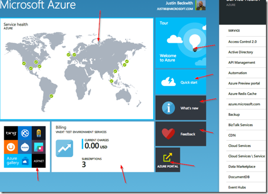
Azure Portal is another good example:
Common for widget based dashboards is that each widget is a self contained part: It can work alone or with 1000 other widgets without interfering with the other widgets. Another common feature for widget based apps is the shell: Shell contains the common application UI (like the toolbar) and hosts the widgets.
Building widget based dashboard using UWP
We’re going to use couple libraries to build the dashboard: Caliburn.Micro is used to bring down the amount of code and Telerik’s UI for UWP is used for some pretty widgets. The Telerik’s UI components are great but in this case they are completely optional: You can create your widgets and the shell using any controls you want. But I would recommend using Caliburn.Micro as it allows to keep our code base simple and clean.
Caliburn.Micro
Caliburn.Micro is a MVVM framework. It is a convention based framework and after you learn the conventions, it is powerful and simple to use. The reason we’re using Caliburn.Micro in this app is its built-in view locator. The view locator is the component which allows you to easily build UWP dashboard apps and which allows us to do that with minimum amount of code.
Creating our app
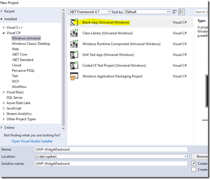
We will start by creating the app and configuring Caliburn.Micro. Starting point is the “Blank App (Universal Windows)” template:
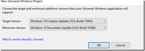
Target and minimum versions don’t really matter:
MainPage.xaml can be deleted at this point.
To hook up Caliburn.Micro, first add the Nuget package “Caliburn.Micro” (version 3.2):
Then open App.xaml and change it into the following format:
<cm:CaliburnApplication
x:Class="UWP_WidgetDasboard.App"    xmlns="http://schemas.microsoft.com/winfx/2006/xaml/presentation"
    xmlns:x="http://schemas.microsoft.com/winfx/2006/xaml"
    xmlns:cm="using:Caliburn.Micro"
    RequestedTheme="Light">

</cm:CaliburnApplication>
All the App.xaml.cs requires few changes: It doesn’t inherit Application anymore so we can remove that and also some Caliburn.Micro specific setup is needed. Once you get this right, you can usually just copy paste the code from app to app. The full App.xaml.cs can be found from this tutorial’s GitHub repository but here’s the most interesting parts:
        protected override void Configure()
        {
            container = new WinRTContainer();
            container.RegisterWinRTServices();

            container.Singleton<ShellViewModel>();
        }

        protected override void OnLaunched(LaunchActivatedEventArgs args)
        {
            if (args.PreviousExecutionState == ApplicationExecutionState.Running)
                return;

            DisplayRootView<ShellView>();
        }
Configure-method will be used to initialize the widgets and the shell. OnLaunched decides page is shown at launch. As we can see the code uses ShellViewModel and ShellView so let’s create those before we can hit F5 to make sure everything works.
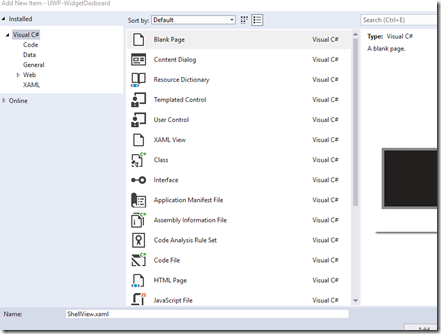
ShellView is just a blank page:
And ShellViewModel is a class which inherits Screen:
using Caliburn.Micro;

namespace UWP_WidgetDasboard
{
    public class ShellViewModel : Screen
    {
    }
}
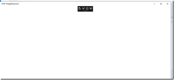
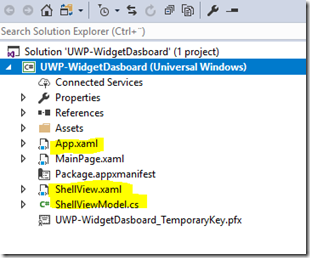
Now if you hit F5 you should see our empty app starting without errors:At this point we have a working app with a shell but without any content. The solution explorer is the following (highlighted are the files which we have changed):
Next up is creating the widgets.
Creating the first widget
For each widget we need two things:
- UserControl for the UI
- Caliburn.Micro based ViewModel (Screen or Conductor) for the logic
We also have to have a common IWidget interface, which can be empty. This is our starting point:
namespace UWP_WidgetDasboard
{
    public interface IWidget
    {
    }
}
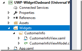
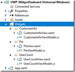
Let’s create our first widget: Customer Info. To get some structure, we’re going to create a folder for each widget. These aren’t required but they make things easier to find. Create an empty user control (CustomerInfoView) and an empty class (CustomerInfoViewModel) into the project:
CustomerInfoViewModel is the place where widget’s logic will be: It can contact the database/web api to fetch data or access some resource packaged with the app. The CustomerInfoViewModel should be a “Caliburn.Micro ViewModel”, meaning it needs to inherits from a Screen or from a Conductor. Screen is your choice if you want to display information about a single object, Conductor is great if you have a list of object. For example CustomerInfoViewModel is a Screen because we just display info about a single Customer. CustomerSearchViewModel should be a Conductor as it quite likely displays a range of customers.
To make things work, the widget’s view model should also implement our IWidget interface. When using Caliburn.Micro, the widget’s initialization logic can be placed inside the OnActivate-method. Let’s insert some logic:
    public class CustomerInfoViewModel : Screen, IWidget
    {
        private Customer _customer;

        public Customer Customer
        {
            get { return _customer; }
            set
            {
                _customer = value;
                NotifyOfPropertyChange(() => Customer);
            }
        }

        protected override void OnActivate()
        {
            this.Customer = new Customer("Mikael", "Koskinen");
        }
    }

    public class Customer
    {
        public string FirstName { get; set; }
        public string LastName { get; set; }

        public Customer(string firstName, string lastName)
        {
            FirstName = firstName;
            LastName = lastName;
        }
    }
Now we just implement the UI for our widget to display customer information:
    <Grid>

        <Grid.ColumnDefinitions>
            <ColumnDefinition/>
            <ColumnDefinition/>
        </Grid.ColumnDefinitions>
        <Grid.RowDefinitions>
            <RowDefinition/>
            <RowDefinition/>
            <RowDefinition/>
        </Grid.RowDefinitions>

        <TextBlock Style="{StaticResource TitleTextBlockStyle}" Grid.ColumnSpan="2" Text="Customer Information:"/>
        <TextBlock Style="{StaticResource SubtitleTextBlockStyle}" Grid.Column="0" Grid.Row="1">First name:</TextBlock>
        <TextBlock Style="{StaticResource SubtitleTextBlockStyle}" Grid.Column="0" Grid.Row="2">Last name:</TextBlock>

        <TextBlock Style="{StaticResource BodyTextBlockStyle}" Grid.Column="1" Grid.Row="1" Text="{Binding Customer.FirstName}"/>
        <TextBlock Style="{StaticResource BodyTextBlockStyle}" Grid.Column="1" Grid.Row="2" Text="{Binding Customer.LastName}"/>

    </Grid>
Next up is making the shell work.
Creating the shell
The shell hosts the widgets and the common UI functions. We’re going the skip the common UI functions and just include a container which contains all the widgets.
The shell is where you decide how you want to represent the widgets: You can use similar square box containers as VSTS’ or you can host each widget in a tab control or hub or carousel or anything you like. We’re going to use the square box containers.
All the widgets are “injected” into the ShellViewModel using dependency injection. This way shell doesn’t need to know which widgets it is currently hosting.
To get the dependency injection working, we need to add all the classes implementing IWidget into the Caliburn.Micro’s DI container. This is done in App.xaml.cs:
        protected override void Configure()
        {
            container = new WinRTContainer();
            container.RegisterWinRTServices();

            container.Singleton<ShellViewModel>();
            AddWidgets();
        }

        private void AddWidgets()
        {
            var types = typeof(ShellViewModel).GetTypeInfo().Assembly.GetTypes().ToList();
            var widgets = types.Where(type => type.GetTypeInfo().IsClass && System.Reflection.TypeExtensions.IsAssignableFrom(typeof(IWidget), type)).ToList();

            foreach (var widget in widgets)
            {
                container.RegisterPerRequest(typeof(IWidget), null, widget);
            }
        }
Now when we run the app, all the widgets implementing IWidget are automatically added inside the DI container. We can use this in our ShellViewModel. At this point we should also change ShellViewModel to inherit Conductor<IWidget>. This provides us Items-property, which we can use to add the widgets:
    public class ShellViewModel : Conductor<IWidget>.Collection.AllActive
    {
        public ShellViewModel(IEnumerable<IWidget> widgets)
        {
            this.Items.AddRange(widgets);
        }
    }
Now we have the basic logic implemented and we just need to display the widgets inside the ShellView. For this you can use any container. We’re going to use ItemsControl with ItemsWrapGrid:
    <Grid Background="{ThemeResource ApplicationPageBackgroundThemeBrush}">
        <ItemsControl x:Name="Items">
            <ItemsControl.ItemsPanel>
                <ItemsPanelTemplate>
                    <ItemsWrapGrid Orientation="Horizontal"/>
                </ItemsPanelTemplate>
            </ItemsControl.ItemsPanel>
            <ItemsControl.ItemTemplate>
                <DataTemplate>
                    <Border BorderThickness="2" BorderBrush="LightBlue" Margin="12" Width="400" Height="400">
                        <Grid>
                            <Border Background="LightBlue" Opacity="0.1"/>
                            <ContentControl Margin="12" micro:View.Model="{Binding}" HorizontalContentAlignment="Stretch" VerticalContentAlignment="Stretch" />
                        </Grid>
                    </Border>
                </DataTemplate>
            </ItemsControl.ItemTemplate>
        </ItemsControl>
    </Grid>
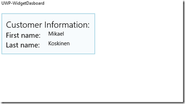
Now when you run the application, you should see our single widget hosted inside the shell:
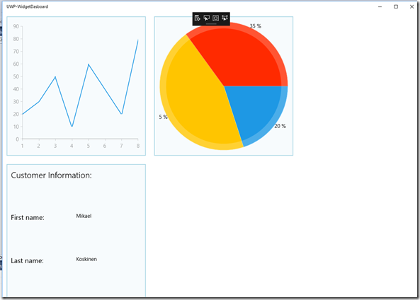
We can make sure everything works correctly by adding couple more widgets:
Conclusion and further work:
This tutorial shows what it takes to create UWP dashboard widget app. It doesn’t take much: Only few lines of code is required to for the shell and IWidget, after which all the coding takes place inside the widgets. As each widget can be as complicated or as simple as they need, bulk of your code will be place into the individual widgets.
To make this full blown solution, the widget system needs some more functionality:
- Instead of always having all the widgets, user should be able to add and remove widgets.
- Common widget elements, like title and action buttons.
- Different sized widgets instead of a single fixed size.
- Ability to send notifications from a widget to a widget using Event aggregator.
- Ability to send notifications from a widget to the shell using Event aggregator.
The full source code can be found from the GitHub: https://github.com/mikoskinen/blog/tree/master/UWP-WidgetDasboard
