0 Comments

Adaptive Cards for Blazor is a community project that provides Adaptive Cards support for your Blazor applications. Adaptive Cards are a way to exchange content in a common and consistent way. Adaptive Cards can be integrated into different applications like Microsoft Teams and Outlook. Adaptive Cards can also be integrated into custom applications built with .NET, iOS and JavaScript. And now Blazor is also supported.

The project’s home site with documentation can be found from https://www.adaptivecardsblazor.com/ and I especially recommend you to check out the Getting Started guide.

There’s also more than 40 samples available through the Sample Site. But please note that the samples are currently hosted on a free Azure App Service plan. If the sample site gets too much traffic, Azure will throttle/take down the site. You can run the samples on your own computer by cloning the repository.

Adaptive Cards for Blazor version 1.0.0 is available through NuGet and the source code and issue list is available through GitHub.

Features

Here's few of the most notable features of this project:

  • JSON-support: Create and display Adaptive Cards from the JSON-schema.
  • Templating: Combine models (objects) and the schema.
  • Card Collections: Display a list of cards based on model and use template selector to customize the output.
  • Action support: Handle Submit and OpenUrl actions using C#.
  • Native .NET-based solution: Blazor Adaptive Cards is based on the official .NET SDK for Adaptive Cards.

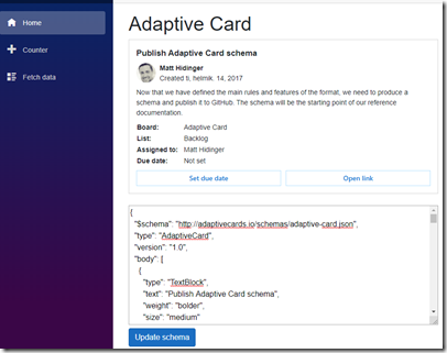
One of the most powerful features provided by Adaptive Cards for Blazor is Card Collections. Card Collections can be used to display a collection of cards, based on a list of models (C# objects) and a schema. This allows you to easily transform your application from this:

image

To this:

animation2

Here’s the required code for displaying a Card Collection:

    <CardCollection Models="@forecasts" Schema="@schema"></CardCollection>

Card Collections can be animated with JS & Css libraries and in the example above, AOS was used. For more information about animations, please see the documentation.

Another powerful feature of the project is handling actions in C#. There’s couple ways of doing this, both described in the documentation. Here’s a quick sample of using OnSubmitAction:

<AdaptiveCard Schema="@Schemas.SimpleSubmit" OnSubmitAction="OnSubmit"></AdaptiveCard>

@code {
    string actionDetails = "";

    private void OnSubmit(AdaptiveCards.Blazor.Actions.SubmitEventArgs eventArgs)
    {
        ...
    }
}

Quick Start

The Getting Started guide teaches you how to build Blazor applications using Adaptive Cards for Blazor. It's the recommended source of information for those who are new to Adaptive Cards.

For a quick introduction, here’s how to add Adaptive Cards for Blazor into your app and to render your first Adaptive Card:

Add NuGet

Install-Package AdaptiveCardsBlazor
Configure Startup.cs

        public void ConfigureServices(IServiceCollection services)
        {
            services.AddRazorPages();
            services.AddServerSideBlazor();
            
            ...

            services.AddBlazorAdaptiveCards();
        }

Configure _Imports.razor

@using AdaptiveCards.Blazor

Add JS interop into _Host.cshtml

    <script src="_content/AdaptiveCardsBlazor/adaptiveCardsJsInterop.js"></script>

Create the schema in your component

@code {
    string schema = @"{
      ""$schema"": ""http://adaptivecards.io/schemas/adaptive-card.json"",
      ""type"": ""AdaptiveCard"",
      ""version"": ""1.2"",
      ""body"": [
        {
          ""type"": ""TextBlock"",
          ""text"": ""Adaptive Cards for Blazor simple example""
        }
      ]
    }";
}

Render the card by adding component into page

<AdaptiveCard Schema="@schema"></AdaptiveCard>

Requirements

Adaptive Cards for Blazor targets .NET Core 3.0. Please also note that the library has been tested with the server side version of Blazor.

Fully tested and supported version of Adaptive Cards for Webassembly version of Blazor is coming shortly.

License

Adaptive Cards for Blazor is MIT licensed. The library uses the following other libraries:

AdaptiveCards.Rendering.Html: MIT-license
Scriban: BSD 2-Clause "Simplified" License

0 Comments

.NET Core 3.0 has arrived and that means Blazor is here! Happy days!

I’m still little gutted that the Razor Page & Blazor interop was scaled down so near the release as we were looking forward to enhancing our Razor Pages with a bit of Blazor magic. But at last we can still include complete Blazor pages next to Razor Pages as shown in the “Combining Razor and Blazor Pages in a Single ASP.NET Core 3 Application” post couple weeks ago. That tutorial is for last preview release of .NET Core 3 but should work without any code changes with the 3.0.

As .NET Core 3.0 is here, that means Blazor.EventAggregator, Blazor.Page and Blazor.CommandButton have all been updated to .NET Core 3.0. For a short introduction of these components, please see the previous post “Blazor.CommandButton and Blazor.EventAggregator updated for ASP.NET Core 3 RC1”.

So, what’s next? I’m happy to say that work with Blazor.AdaptiveCards is almost complete and the first release is near. As the name suggests, Blazor.AdaptiveCards will bring AdaptiveCards to Blazor and I’m quite happy of the implementation. Here’s a sneak peek:

image

Also, now that the server side version of Blazor is done (or at least officially released), WebAssembly-version of Blazor is quite likely starting to more attention from Microsoft and from community. Making sure that all the controls mentioned above work nicely with WebAssembly version of Blazor is a priority. There’s no known issues but more testing is needed.

0 Comments

Just a last minor update to both the Blazor.CommandButton and to Blazor.EventAggregator: Both of the libraries now target ASP.NET Core 3 RC 1.

The Blazor.Page component, which was released earlier this week already targets RC1 so it didn’t need an update.

Here’s a short summary of all the Blazor components mentioned above:

Blazor.EventAggregator

Blazor.EventAggregator is a lightweight Event Aggregator for Blazor. Event aggregator is used for indirect component to component communication. In the event aggregator pattern you have message/event publishers and subscribers. In the case of Blazor, a component can publish its events and other component(s) can react to those events.

Project home: https://github.com/mikoskinen/Blazor.EventAggregator

Nuget: https://www.nuget.org/packages/EventAggregator.Blazor/

Blazor.CommandButton

Blazor.CommandButton is a lightweight button component for Blazor. CommandButton provides support for setting a guard method or property to the button. Guard methods allow you to disable or enable buttons based on some conditions. Example: If you have a button which runt the method SaveCustomer, with Blazor.CommandButton you can add a boolean property named CanSaveCustomer, which can then enable or disable the SaveCustomer-button.

Project home: https://github.com/mikoskinen/Blazor.CommandButton

Nuget: https://www.nuget.org/packages/CommandButton.Blazor/

Blazor.Page

Blazor.Page is a component designed to be used as the base component for your Blazor Pages. It offers two features for your pages: Ability to set and get page titleand ability to set data context for your page. Data context can be used similar to ViewModels in MVVM or similar to PageModels in Razor Pages

Project home: https://github.com/mikoskinen/Blazor.Page

Nuget: https://www.nuget.org/packages/Page.Blazor

0 Comments

cf6d13f0-79ae-449e-b0a0-62813301354f

Blazor.Page is a new MIT-licensed component, designed to be used as the base component for your Blazor Pages. It offers two features for your pages:

  • Ability to set and get page title
  • (Optionally) Ability to set data context for your page. Data context can be used similar to ViewModels in MVVM or similar to PageModels in Razor Pages.

Getting Started

Blazor.Page is available as a Nuget-package: https://www.nuget.org/packages/Page.Blazor

To get started, install the package. After installation, your project file should contain a ProjectReference to Page.Blazor:

image

Now, we need to include Javascript-interop –library. If your only going to use the data context-feature of the page component, this isn’t needed. The JS-file should be included in the _Host.cshtml:

    <script src="_content/Page.Blazor/blazorPageInterop.js"></script>

And your done. The next job is creating a new page which inherits Blazor.Page.Page:

@page "/"
@inherits Blazor.Page.Page

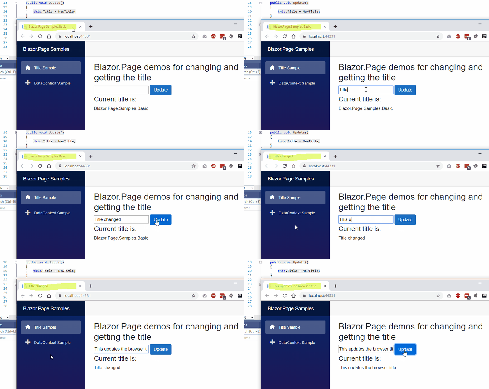
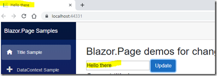
And now you can use your page to edit the title (HTML title tag) through Title-property:

    public void Update()
    {
        this.Title = NewTitle;
    }

image

Using the data context

The idea behind the data context comes from WPF/Silverlight, where DataContext-property was used in MVVM-scenarios. Blazor.Page provides a way of creating a PageModel/ViewModel for you page by offering an abstract PageModelBase-class. Here’s an example of a PageModel:

    public class CounterPageModel : PageModelBase
    {
        private readonly CustomerService _customerService;
        public List<Customer> Customers { get; set; } = new List<Customer>();

        public CounterPageModel(CustomerService customerService)
        {
            _customerService = customerService;
        }

        public override async Task OnInitializedAsync()
        {
            await LoadCustomers();
        }

        private async Task LoadCustomers()
        {
            var custs = await _customerService.GetCustomers();

            Customers.Clear();
            Customers.AddRange(custs);
        }

        public void AddCustomer(Customer customer)
        {
            Customers.Add(customer);
        }
    }

As you can see, the CounterPageModel above is used to move the duties from the Page-component (the View) into the PageModel (ViewModel/PageModel). To set the data context in your page, inherit the generic Page-class:

@page "/counter"
@inherits Page<CounterPageModel>

The data context is injected into your Page, so make sure to register these into your DI container:

        // This method gets called by the runtime. Use this method to add services to the container.
        // For more information on how to configure your application, visit https://go.microsoft.com/fwlink/?LinkID=398940
        public void ConfigureServices(IServiceCollection services)
        {
            services.AddRazorPages();
            services.AddServerSideBlazor();

            services.AddTransient<CounterPageModel>();
            services.AddTransient<CustomerService>();
        }

Now you can access the functionalities and the data of CounterPageModel through the Page’s DataContext-property:

@page "/counter"
@inherits Page<CounterPageModel>

<h2>Page with datacontext sample</h2>

<h4>List of customers:</h4>
@if (DataContext.Customers?.Any() == true)
{
    <table>
        <thead>
            <tr>
                <th>First name</th>
                <th>Last name</th>
            </tr>
        </thead>
        <tbody>
            @foreach(var customer in DataContext.Customers)
            {
            <tr>
                <td>@customer.FirstName</td>
                <td>@customer.LastName</td>
            </tr>
            }
        </tbody>
    </table>
}
<br />
<input type="button" class="btn btn-primary" value="Add customer" @onclick="@(() => DataContext.AddCustomer(new Customer() { FirstName = Guid.NewGuid().ToString(), LastName = Guid.NewGuid().ToString() }))" />

Sample

Full sample of using both of the features is available from GitHub: https://github.com/mikoskinen/Blazor.Page/tree/master/samples/Blazor.Page.Samples.Basic

Background

Not all Blazor components should be treated equal. Some components are used as Button-replacements. Some provide wrappers for Bootstrap controls. Pages are one of the special cases where I think a different base class is required. Pages are often long-lived and they are more than just controls.

Blazor doesn’t currently support “native” or built-in way of changing the HTML page’s title. This library aims to make it as easy as possible. Also, coming from MVVM and Razor Pages, it’s often desired to separate the View and the Model. This library allows you to inject a PageModel/ViewModel into your page as a data context. PageModel can be used to “offload” the functionality from the view.

Source code

The source code Blazor.Page is available from GitHub: https://github.com/mikoskinen/Blazor.Page

Requirements

The library has been developed and tested using the following tools:

  • .NET Core 3.0 RC 1
  • Visual Studio 2019 Preview
  • Server side Blazor

0 Comments

0e3c6ab1-51d4-4615-a1bb-b84b7e04af83

Blazor.CommandButton is a new MIT-licensed lightweight button component for Blazor. CommandButton provides support for setting a guard method or property to the button. Guard methods allow you to disable or enable buttons based on some conditions. Some examples:

  • Button is disabled if user doesn't have the appropriate authorization
  • Button is disabled if some required input is missing.

This release has been tested with the server side version of .NET Core v3.0.0-preview9 Blazor.

The first release is 0.9.0 and it’s available through Nuget. Source code is available from Github.

Getting started

You can easily switch from button to CommandButton. If you have the following code:

<button class="btn btn-primary" @onclick="@IncrementCount">Increment by 1</button>

You can change it to use CommandButton:

<CommandButton class="btn btn-primary" @onclick="@IncrementCount">Increment by 1</CommandButton>

To guard the IncrementCount-method, you can add a boolean property with name CanIncrementCount:

public bool CanIncrementCount { get; set; } = false;

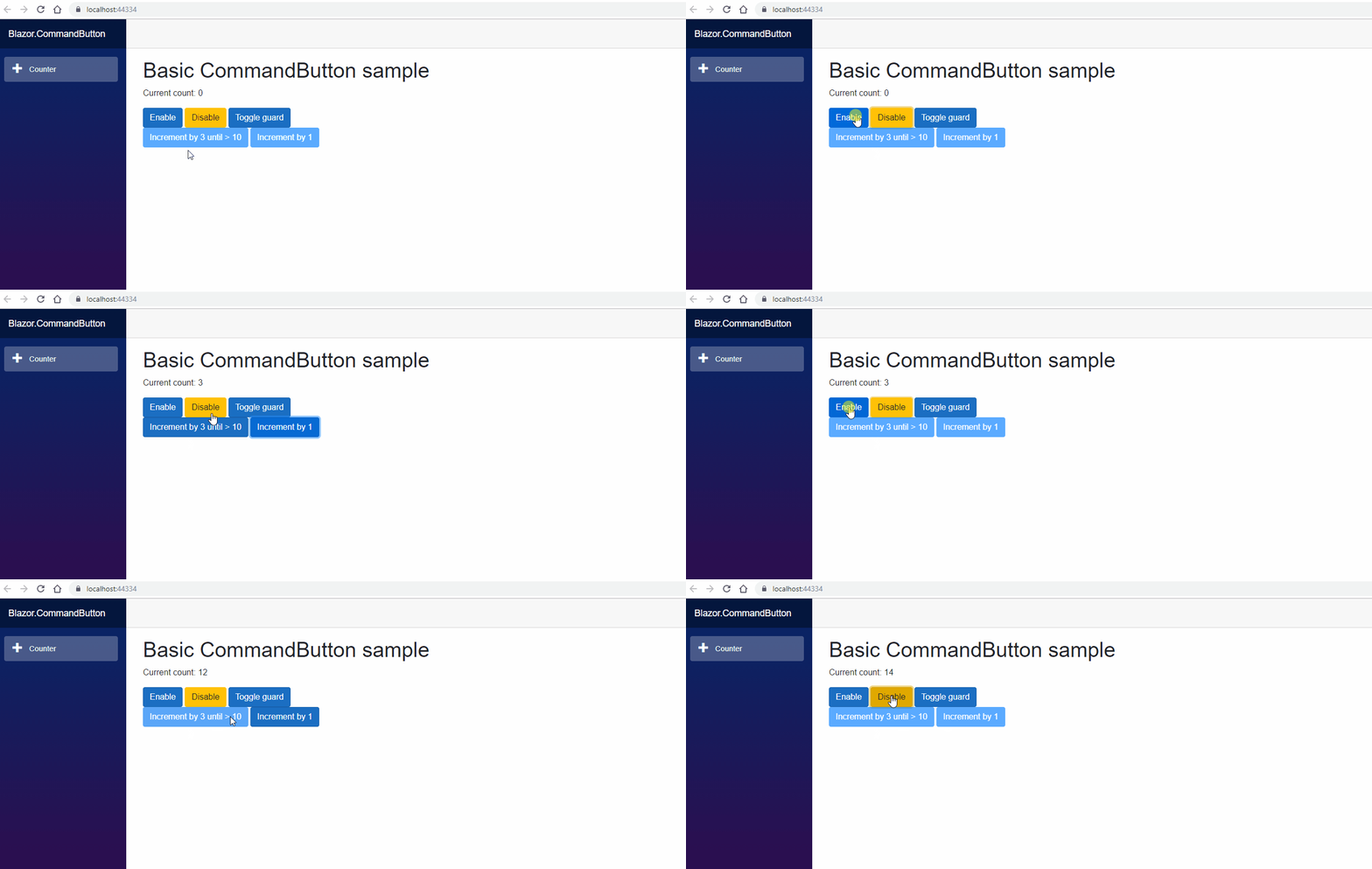
If the guard return false, the button is disabled. When guard returns true, the button is automatically enabled.

Code sample

Here’s a full sample of using the CommandButton component:

<p>Current count: @currentCount</p>

<CommandButton class="btn btn-primary" @onclick="@(() => CanIncrementCount = true)">Enable</CommandButton>
<CommandButton class="btn btn-warning" @onclick="@(() => CanIncrementCount = false)">Disable</CommandButton>
<CommandButton class="btn btn-primary" @onclick="@ToggleGuard">Toggle guard</CommandButton>
<br/>
<CommandButton class="btn btn-primary" @onclick="@(() => IncrementCount(3))" Guard="@(() => currentCount < 10 && CanIncrementCount)">Increment by 3 until > 10</CommandButton>
<CommandButton class="btn btn-primary" @onclick="@IncrementCount">Increment by 1</CommandButton>

@code {
    int currentCount = 0;

    public void IncrementCount()
    {
        currentCount++;
    }

    public Task IncrementCount(int value)
    {
        currentCount += value;

        return Task.CompletedTask;
    }

    public bool CanIncrementCount { get; set; } = false;

    public void ToggleGuard()
    {
        CanIncrementCount = !CanIncrementCount;
    }
}

Guarding methods with a boolean property

If your CommandButton's onclick is bound to a method like in the previous example, CommandButton can automatically determine the guard property's name by adding "Can" infront of it.

  • IncrementCount -> CanIncrementCount
  • SaveData -> CanSaveData
  • DeleteCustomer -> CanDeleteCustomer

Guarding lambdas

If your CommandButton is bound against an lambda, guard property's name can't be automatically decided. For these scenarios you can provide the guard through component's Guard-property:

<CommandButton class="btn btn-primary" @onclick="@(() => IncrementCount(3))" Guard="@(() => currentCount < 10 && CanIncrementCount)">Increment by 3 until > 10</CommandButton>

Samples

The project site contains a full working sample of CommandButton.

Requirements

The library has been developed and tested using the following tools:

  • .NET Core 3.0 Preview 9
  • Visual Studio 2019 Preview