WP7: Display Different Data Template for Different Items in the List - DataTemplateSelectors with the help of Caliburn.Micro
 In this Windows Phone 7 tutorial you will learn how to take advantage of Caliburn.Micro when displaying a list of non-identical objects to the user.
Background
Displaying a ListBox for a list which contains different kinds of items is a common scenario when developing applications for Windows Phone. For example your list can present a folder which contains files and subfolders. When presenting this list to the user you usually want the files and folders to look different. There’s many ways to make this happen, like ValueConverters and the following implementation using abstract DataTemplateSelector.
But if you’re using the Caliburn.Microframrwork, you’re all set. The functionalities inside the framework will take care of this automatically for you.
Scenario
You want to present a folder structure to the end user. You have one bindable list which contains both the subfolders and files and you have one ListBox inside the XAML which shows both types of items. The File.cs and Folder.cs files contain our models:
    public class File
    {
        public int Id { get; private set; }
        public string Name { get; private set; }
        public double Size { get; private set; }

        public File(int id, string name, double size)
        {
            Id = id;
            Name = name;
            Size = size;
        }
    }
public class Folder
{
public int Id { get; private set; }
public string Name { get; private set; }
public List<Folder> SubFolders { get; private set; }
public Folder(int id, string name, List<Folder> subFolders)
{
Id = id;
Name = name;
SubFolders = subFolders;
}
}In the ListBox you want to display the item’s name and a little icon next to it to indicate the item’s type.
Implementation – The ViewModel
What we’re going to need is just one ViewModel. We’re not going to create ViewModels for our models:
- MainPageViewModel – The main VM which contains the list which is shown to the user.
The MainPageViewModel inherit’s the Caliburn.Micro’s Conductor-class. The Conductor provides our VM an observable list where we can add items. When the list is modified, our view automatically gets a notification and knows to update itself.
You could manually create a new ObservableCollection , but in our case we try to take the full advantage out of our framework of choice.
The list can be accessed through the Items-property. So, to add a new item into our observable list, we can just call Items.Add(OurObject). As you’ll notice, we have defined the conductor as type of object. This mean that the Items-property inside the conductor is of type BindableCollection<object>. Meaning, you can actually add any type of items inside the collection. You can use more precise type if you know what kind of items your list contains.
The actual work the MainPageViewModel has to do is to create some fixed data for our application:
    public class MainPageViewModel : Conductor<object>.Collection.AllActive
    {
        protected override void OnInitialize()
        {
            Items.AddRange(new List<object>()
                               {
                                   new Folder(1, "Folder 1", null),
                                   new Folder(2, "Folder 2", null),
                                   new File(1, "File 1", 30.0),
                                   new File(2, "File 2", 30.0),
                                   new File(3, "File 3", 30.0),
                                   new Folder(4, "Folder 3", null),
                               });
        }
    }
We now have our ViewModel all set up so let’s concentrate on the Views next.
Implementation – The Views
We need three different Views:
- MainPage.xaml – The page which contains our ListBox
- FolderView – A UserControl which displays the Folder-item
- FileViewModel – A UserControl which displays the File-item
Our MainPage.xaml is simple, containing only the ListBox. We’ll name it “Items”so that the Caliburn.Micro automatically binds it to our MainPageViewModel’s Items-property. What differs from the usual is our DataTemplate. We’re making the Caliburn.Micro to find the correct UserControl to represent our item.
            <ListBox x:Name="Items">
                <ListBox.ItemTemplate>
                    <DataTemplate>
                        <ContentControl cal:View.Model="{Binding .}" HorizontalAlignment="Left" />
                    </DataTemplate>
                </ListBox.ItemTemplate>
            </ListBox>
Now that our MainPage is all set we can create the UserControls which represent the items inside the folder. Here’s the implementation of FileView:
    <Grid x:Name="LayoutRoot" Background="Transparent" Margin="12 0 0 0">
        <Grid.ColumnDefinitions>
            <ColumnDefinition Width="auto"></ColumnDefinition>
            <ColumnDefinition></ColumnDefinition>
        </Grid.ColumnDefinitions>
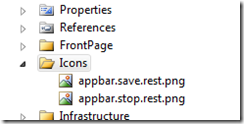
        <Image Grid.Column="0" Source="/Icons/appbar.save.rest.png"/>
        <TextBlock Grid.Column="1" Text="{Binding Name}" VerticalAlignment="Center" Style="{StaticResource PhoneTextNormalStyle}"/>
    </Grid>
And the FolderView looks similar, we’ll just change the Image. But notice, you could customize these views anyway you want, for example displaying the folder’s subfolders inline.
    <Grid x:Name="LayoutRoot" Background="Transparent">
        <Grid.ColumnDefinitions>
            <ColumnDefinition Width="auto"></ColumnDefinition>
            <ColumnDefinition></ColumnDefinition>
        </Grid.ColumnDefinitions>
        <Image Grid.Column="0" Source="/Icons/appbar.folder.rest.png"/>
        <TextBlock Grid.Column="1" Text="{Binding Name}" VerticalAlignment="Center" Style="{StaticResource PhoneTextTitle3Style}"/>
    </Grid>
 If we now run the application we will see that everything is almost set, except that the Caliburn.Micro can’t find the correct views for the File and Folder-classes. Let’s take care of that next.
Matching the ViewModel and Models to Views
As you remember, we didn’t create ViewModel-classes for the models. Instead we’ll tell Caliburn.Micro how to match the File and Folder –models to their views.
Caliburn.Micro uses conventions to match Views and ViewModels. The most common convention for finding a View for a ViewModel is to just drop the Model from the type name, for example CustomerViewModel –> CustomerView. The framework is highly configurable and you can add your own conventions.
In order for the framework to find our views, we’ll add couple rules to its ViewLocator. We configure the ViewLocator inside the application’s bootstrapper. We could have named our models FileViewModel and FolderViewModel and if we had done so, we wouldn’t need the following because the Caliburn.Micro could automatically find the views:
            ViewLocator.NameTransformer.AddRule("caliburn_micro_datatemplate_selector.File", "caliburn_micro_datatemplate_selector.FileView");
            ViewLocator.NameTransformer.AddRule("caliburn_micro_datatemplate_selector.Folder", "caliburn_micro_datatemplate_selector.FolderView");
The code explains itself quite well. We just pass in the ViewModel-type’s full name and the matching View’s full name. To make the code refactoring easier we could use types instead of the magic strings:
            ViewLocator.NameTransformer.AddRule(typeof(File).FullName, typeof(FileView).FullName);
            ViewLocator.NameTransformer.AddRule(typeof (Folder).FullName, typeof (FolderView).FullName);
And that’s it. We now have an application which can handle the situation where one list contains multiple types of objects.
Conclusion
Caliburn.Micro offers a powerful solution for those situations where your list contains multiple types of objects and you want to display them in a single ListBox.
Full source code for the sample app is available from the GitHub.

