UWP XAML: Simple Responsive Layout using Grid and AdaptiveTrigger
 This post will show you how to use repositioning to create a responsive layout for your XAML Universal Windows app (UWP) using Grid and AdaptiveTrigger.
Background
With Windows 10 and its UWP stack, making your app look nice on both mobile and desktop is one of the core requirements. The Responsive design 101 for Universal Windows Platform (UWP) apps guide on MSDN outlines six different ways for responsive design:
- Reposition
- Resize
- Reflow
- Reveal
- Replace
- Re-architect
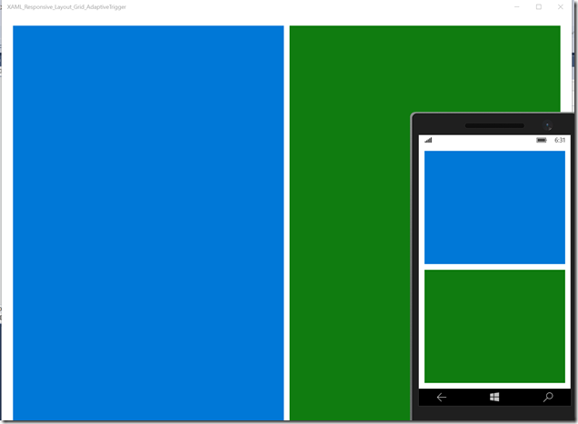
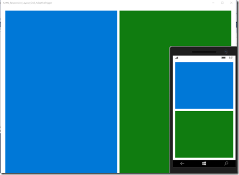
In this post we’ll use the familiar Grid-control with the AdaptiveTrigger to reposition our app’s content. On desktops and tablets the app will use 2-column layout. On mobile devices (or when user resizes the app to have a small window) the second column drops under the first one.
AdaptiveTrigger
AdaptiveTrigger is a new addition in Windows 10. You can use AdaptiveTrigger to automatically change the VisualState when the app’s width or height changes. For example the following Channel9-video contains good information about the AdaptiveTrigger.
The code
Here’s out app’s simple layout:
    <Grid Background="{ThemeResource ApplicationPageBackgroundThemeBrush}" x:Name="MainGrid">

        <Grid.ColumnDefinitions>
            <ColumnDefinition/>
            <ColumnDefinition/>
        </Grid.ColumnDefinitions>
        <Grid.RowDefinitions>
            <RowDefinition/>
            <RowDefinition/>
        </Grid.RowDefinitions>

        <Grid x:Name="FirstGrid" Grid.Column="0" Grid.Row="0" Background="#0078d7" />
        <Grid x:Name="SecondGrid" Grid.Column="1" Grid.Row="0" Background="#107C10" />

    </Grid>
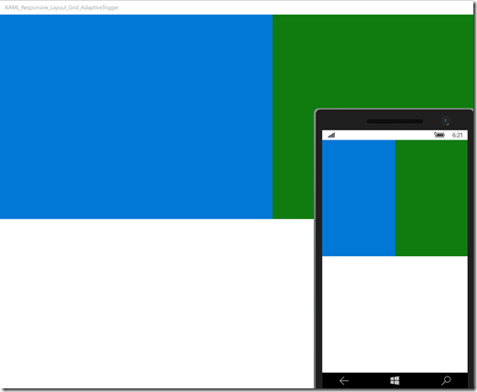
Without any VisualStates or AdaptiveTriggers, the app will look the same on all screen sizes:
But what we want is to reposition our SecondGrid under the FirstGridon mobile devices. To do this, we need to change the Grid.Column and Grid.Row of the SecondGrid:
                        <Setter Target="SecondGrid.(Grid.Column)" Value="0"/>
                        <Setter Target="SecondGrid.(Grid.Row)" Value="1"/>
Also, there’s no need for two columns so we modify the MainGrid for our needs:
                        <Setter Target="MainGrid.RowDefinitions[1].Height" Value="*"/>
                        <Setter Target="MainGrid.ColumnDefinitions[1].Width" Value="auto"/>
Last thing we do is change the margins to make things little prettier:
                        <Setter Target="MainGrid.Margin" Value="12"/>
                        <Setter Target="FirstGrid.Margin" Value="0 0 0 6"/>
                        <Setter Target="SecondGrid.Margin" Value="0 6 0 0"/>
And that’s it. Here’s all the VisualState changes combined. First the WideState (2-column layout):
                        <Setter Target="MainGrid.Margin" Value="24"/>
                        <Setter Target="MainGrid.RowDefinitions[1].Height" Value="auto"/>
                        <Setter Target="MainGrid.ColumnDefinitions[1].Width" Value="*"/>
                        <Setter Target="FirstGrid.Margin" Value="0 0 6 0"/>
                        <Setter Target="SecondGrid.Margin" Value="6 0 0 0"/>
                        <Setter Target="SecondGrid.(Grid.Column)" Value="1"/>
                        <Setter Target="SecondGrid.(Grid.Row)" Value="0"/>
And then the NarrowState (mobile layout):
                        <Setter Target="MainGrid.Margin" Value="12"/>
                        <Setter Target="FirstGrid.Margin" Value="0 0 0 6"/>
                        <Setter Target="SecondGrid.Margin" Value="0 6 0 0"/>
                        <Setter Target="MainGrid.RowDefinitions[1].Height" Value="*"/>
                        <Setter Target="MainGrid.ColumnDefinitions[1].Width" Value="auto"/>
                        <Setter Target="SecondGrid.(Grid.Column)" Value="0"/>
                        <Setter Target="SecondGrid.(Grid.Row)" Value="1"/>
With these few lines of XAML we have used repositioning to achieve a nice responsive layout.
Download source code
The full source code is available from GitHub.
https://github.com/mikoskinen/UWPResponsiveXAMLLayoutGridAdaptiveTrigger

